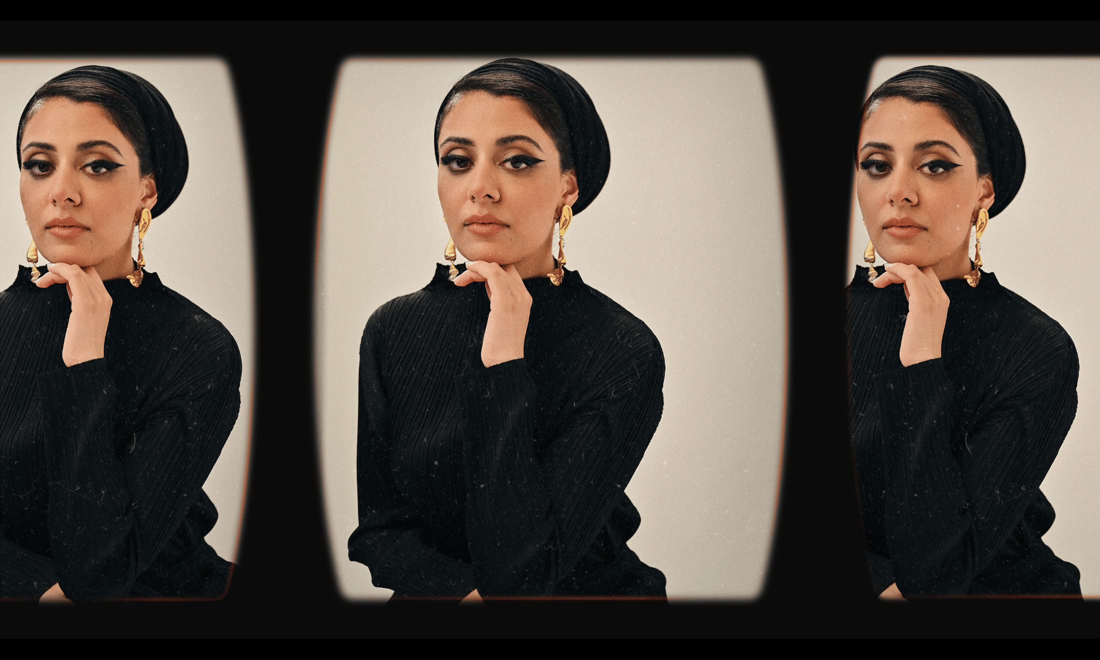
Jada Bruney
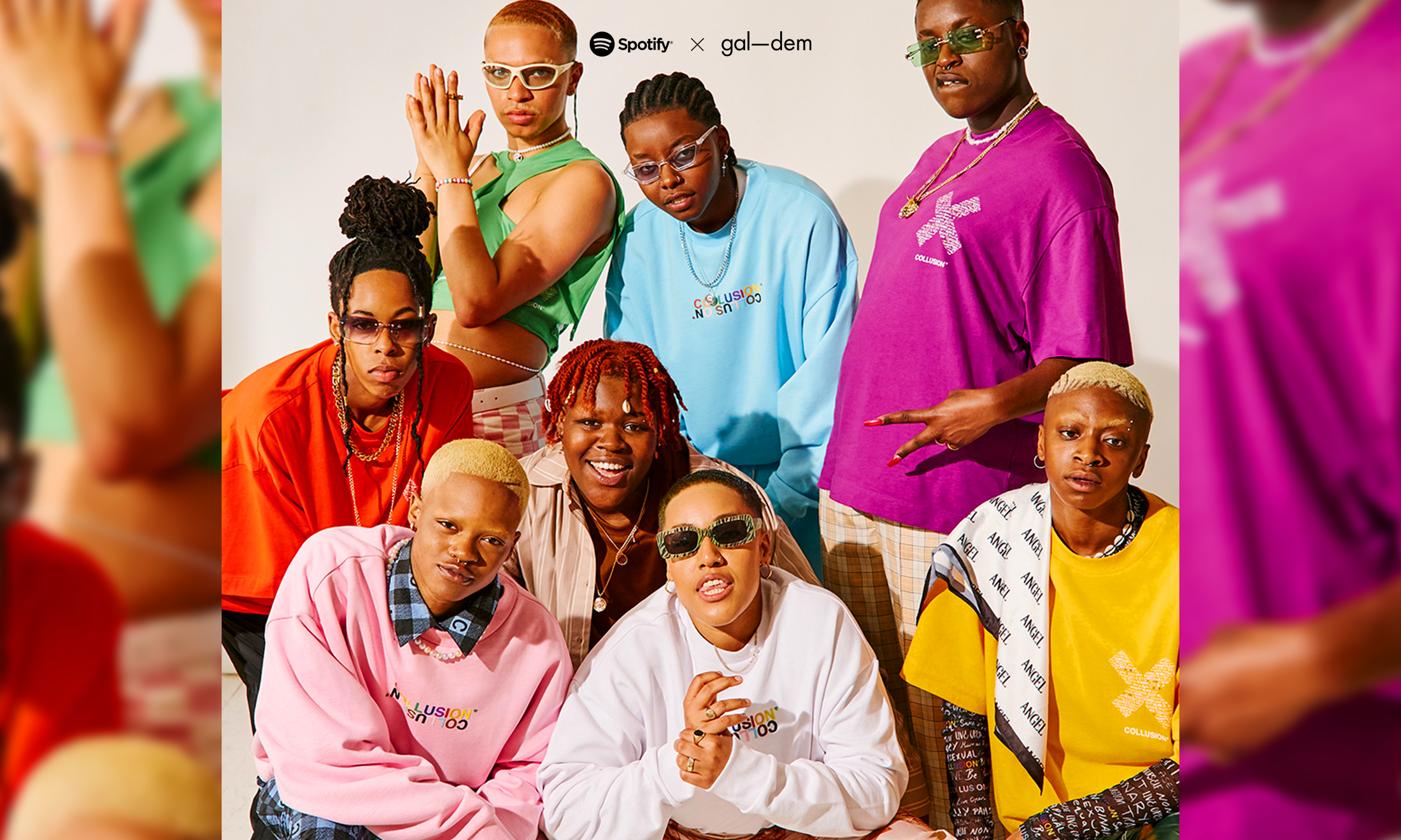
Meet the 9 artists of colour redefining beer culture with Camden Town Brewery
The ‘Fresh Prints’ competition is back, with a special focus on celebrating diversity this year.
DiyoraShadijanova and Editors
08 Nov 2021
Produced in partnership with Camden Town Brewery
What comes to your mind when you think of the word beer? Many, like me, would probably imagine a stuffy pub full of aggravated football fans, who enjoy watching their local club lose every fixture.
Camden Town Brewery recognises that the beer industry doesn’t exactly scream “diversity”, so for its third year, the beer makers are redrawing the narratives around the average beer drinker.
The brewery has brought back its on-pack promotion called ‘Fresh Prints’ to give everyone a free print with every promotional pack of Hells, Off Menu IPA and Pale Ale purchased. Not only does this add a bit of colour to the drinking experience, but it also continues Camden’s rich artistic heritage.
This year’s Fresh Prints sees a whole new crop of artists of colour around the UK , to change our perception of who gets to crack open a cold one, as well as to shine a light on the most exciting creative talent around.
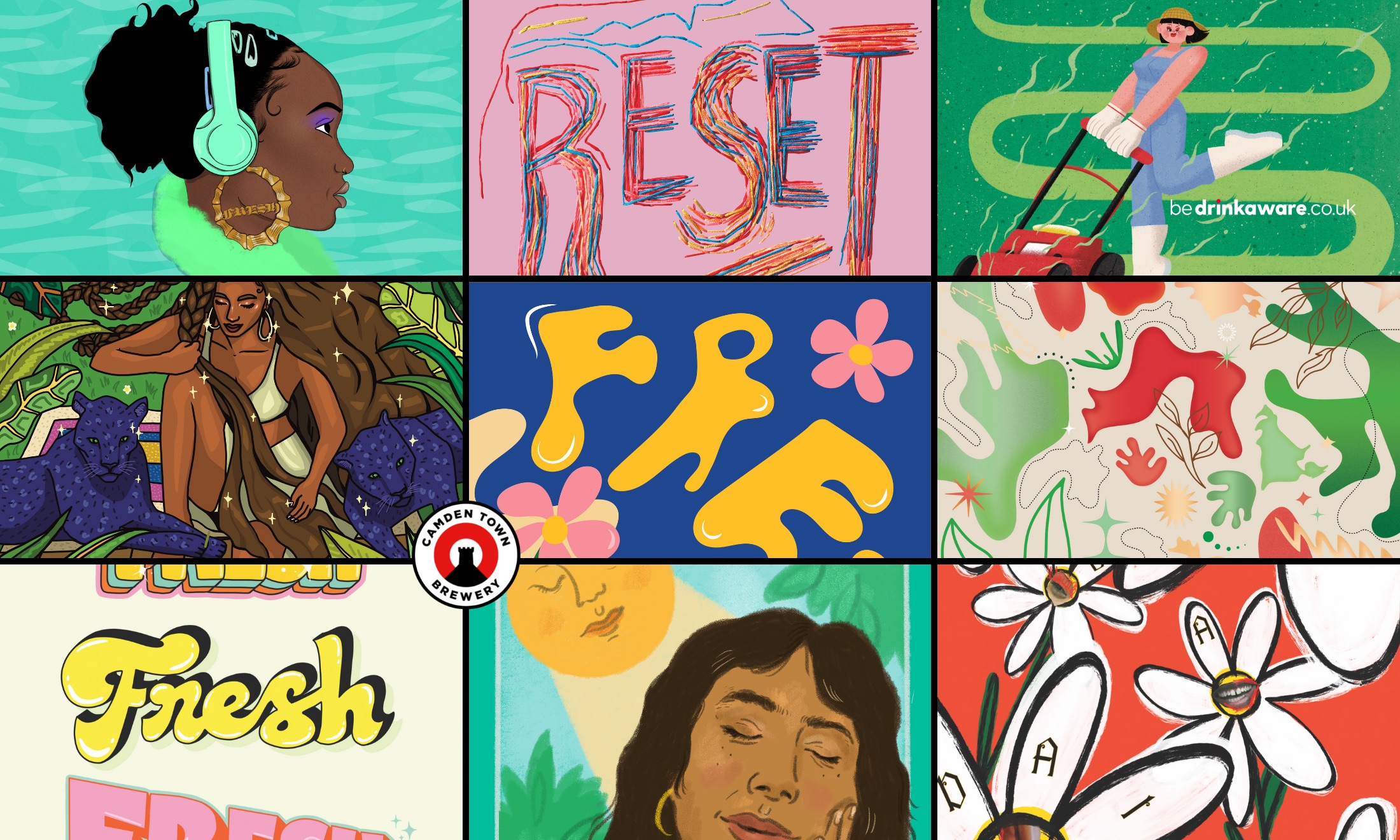
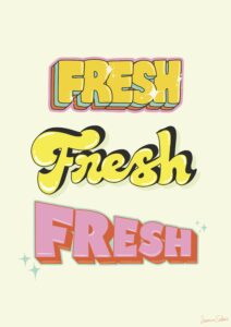
The theme for this year’s competition was around the word ‘fresh’; read on to discover how nine artists made it their own.
Naomi Gennery
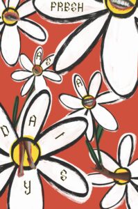
“My illustration is called ‘fresh as a daisy’ and it’s just about how after lockdown, everyone’s opening up again like a flower and coming out of their shells to socialise again,” says Naomi Gennery, an illustrator and graphic designer based in Bristol. The artist’s clever play on words is not accidental; her work is led by strong concepts and explores where art, design, people and culture all meet and merge. “I kind of wanted to show that feeling of when you’ve been out the night before and woken up and you’ve got an eyelash on your face and a banging headache, and then the group chat is going off but you feel absolutely awful.”
“I chose orange because I wanted the illustration to be super bright and energetic”, she continues. And the piece does exactly that with the cut-outs of people’s limbs, mouths and eyes playfully drawing people in.
Inspired by artists like Deborah Roberts, Naomi’s artistic process combines both analogue and hand-rendered steps along with digital enhancements in Photoshop.“I like to use a lot of collage and inspiration from zines and the DIY side of art. I like when you could chop things to create something new and, in my work, I tend to use a lot of mixed media – so there is a lot of copying, scanning merged with digital illustration.”
Mel Lou
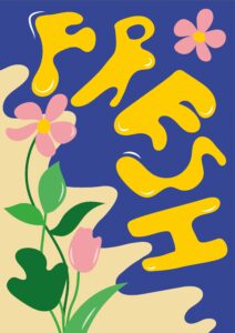
Mel Lou’s bold and colourful design depicts pink flowers with the word “FRESH” wobbling in bright blue water. “I had so much fun with this one because my illustrations usually start boring and I see what comes out and then scrap it, yet here I began with the colours, rather than starting with a layout, which is weird, because I don’t think people usually do that,” they explain. Surprisingly, the natural theme is not their go-to style. “Usually, my illustrations are more tongue in cheek and fun. I do play around with typography, making letters appear wavy looking, but I never usually draw flowers or nature.”
The genderqueer London-based illustrator, who specialises in motion design, takes inspiration from East Asian artists, especially when it comes to colour saturation. “There’s a sick illustrator called Wakana Yamakazi, they’re a great Japanese artist whose work I look at all the time. I love the colour palette of Yamakazi’s work, it’s crazy.”
Parys Gardner
“When I thought of ‘fresh’ as the theme, I was imagining the mid-2010s where I’ve got these massive hoop earrings and nice make-up and that sort of thing. The actual [figure in the] illustration isn’t meant to be me but it’s really relatable,” says Parys Gardener. The Bristol-based contemporary digital illustrator is passionate about creating artwork that represents people of colour, particularly Black women.
“I normally start my process by looking at colours and reference pictures,” Parys adds.
“Pinterest and Instagram are my best friends. I like to think backwards, think about what I want the outcome to be and then work backwards by adding colours and textures.”
But what inspired the colour scheme for this piece? “It sounds really strange, but do you remember those really popular Airwaves menthol strips? The ones that looked like sheets of plastic and they always have cool spots and textures on them. That was a real driving force for the theme and colours.”
Nicole Chui
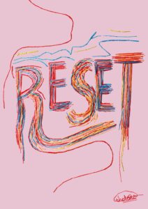
“I learned embroidery from my grandma so it’s always been a nostalgic memory for me. I like using embroidery as a medium, as I find it very therapeutic”, Nicole says. She describes her work as messy, brash and disruptive and believes the stitched medium allows to dismantle perfection and powerfully celebrate honest emotions. “I also love its historical connotations. The representation of embroidery in the media is that it’s something very dainty and feminine and that’s what I want to change.”
Nicole – who was born inHong Kong born but is currently London-based – has a specific creation process. First she completes the actual hand embroidery and then scans the piece for retouching. For the Fresh Prints project, Nicole chose the word ‘reset’ and stitched it in multiple bright colours. “All the colours I use in the piece were very much in line with Camden Town Brewery, and my style, which is very vibrant, colourful, very loud colours”, she explains. “I thought reset was such a nice word, and I want to encourage that mindset of like, just taking time to pause and reset, and rethink what you want to do.”
I learned embroidery from my grandma so it’s always been a nostalgic memory for me. I like using embroidery as a medium, as I find it very therapeutic
Nicole Chui
Jada Bruney
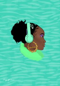
When Jada Bruney, an illustrator based in South London thinks of the word ‘fresh’, she imagines being by a body of water. “I think sitting by a pool, being by water, being surrounded by the elements and nature and I wanted to show that in my illustration”, she says. The artist chooses a bright colour palette, with many shades of greens, blues and browns. “I’m always thinking about the psychology behind certain colours. Blue can represent trust while green represents health and wealth. And so, I thought these colours really go well together and they give off a nice energy. I wanted people to see them and feel refreshed.”
Taking inspiration from artists such as Frida Kahlo, this illustration has many reference points. Jada was influenced by tarot cards and 1960s psychedelic artwork; she was particularly keen to have the representation of a brown-skinned woman. “I feel like there’s not really enough packaging or enough portraiture of Black and brown women out in public”, she adds.
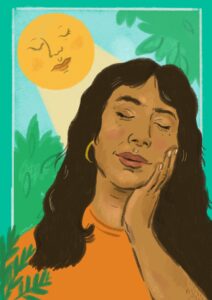
Javie Huxley
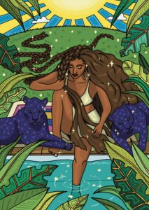
For Javie Huxley, the British-Chilean illustrator based in London, the response to Camden Town Brewery’s ‘fresh’ brief took her back to lockdown walks in nature. “I was thinking about the pandemic,” she recalls. “I don’t know about you, but I just needed to be in natural spaces. So, I’ve appreciated that even more after last year.
“So, my inspiration came from being surrounded by nature and looking up to the sun and feeling the warm rays on your face. The sunshine really revitalises me and I was trying to capture that moment.”
The illustration is a self-portrait of the artist framed by greenery and bathed by a smiling sun in the sky. “The piece ended up being a self-portrait when it came to the features [of the person depicted]. Mostly because, I always try to find reference images and as I’m sure many people have found, you don’t really see many people of colour [in different poses]. So, for that reason, I thought: ‘Ok I’m just going to take a picture of myself doing exactly the pose I wanted and draw from that as a reference’. So, it wasn’t intended to be me, but it came out that way and it was really fun.”
So, my inspiration came from being surrounded by nature and looking up to the sun and feeling the warm rays on your face.
Javie Huxley
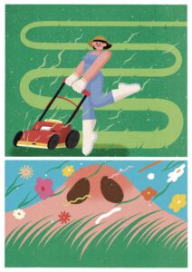
Viviene Shao
Vivienne Shao is a London based illustrator who responded to the theme by creating an image of a young woman cutting grass with a lawnmower and the smell emitted from this action. “In 2019 I went to Scotland Highlands with my parents and it felt so fresh, when you could stand on the mountain, feel the breeze and smell the grass,” she explains the reasoning behind thinking of grass for her artwork. “Then, I was also thinking of how whenever I go back to my dad’s house in Coventry, he asks me to help cut the grass in his garden. I remember that smell so distinctly, especially when it’s cut by the machine.”
But why make the interesting decision to include two images in one? “I used two frames in the illustration because I felt like if I just had the one, it might not have communicated the freshness.”
Jasmine Sehra
For Jasmine Sehra, an illustrator who is passionate about identity and empowerment, the project allowed her to lean into bold colourful typography. “The brief was pretty open so we were able to interpret it in an authentic way”, she says. “My inspirations are old school graphics, 90s graphics. I started typography was [looking at] old school Bollywood posters and cassette tapes. That’s also the inspiration behind the colours I chose as well. I wanted to create something fun, funky and I got to include sparkles.“”
As well as being influenced by vintage film posters and her grandmother, the artist likes to seek creativity from the things lying around her home. “The whole reason I got into type was because I loved the graphics on t-shirts and Bollywood cassette tapes as well as ghazal tapes at my parents’ [house],” she explains.
Farzana Ahmed
For freelance graphic designer Farzana Ahmed, the word ‘fresh’ reminded her of water and everything that consists of it, which then brought her back home – Bangladesh. “I thought of my trips back home and how it made me feel, the colours I saw, and its landscapes, riverbed,” she explains. The colours of her illustration are also inspired by the Bangladesh flag. “The green field represents the land’s natural bounty and red represents the people of Bangladesh during the war of independence.”
The London-based artist drew inspiration from images she had taken when visiting Bangladesh, such as the landscapes, her family home and the greenery. “I just did whatever felt right and I didn’t give myself rules to follow,” she says, explaining the process behind her work.